CLOSE

A well-regarded international academic organization focused on communication studies, ICA saw the need for a new visual identity that could better express its broad range of work around the world. ICA’s focus on communications had evolved from the study of traditional forms – such as journalism and public relations – to include a wide variety of human interactions, from social justice campaigns to gaming. ICA would need to take on this and other challenges in reinventing its visual identity: how to represent such diversity in a simple visual form, how to express that meaning for a variety of cultures, and how to aesthetically express a commitment to scholarly excellence.
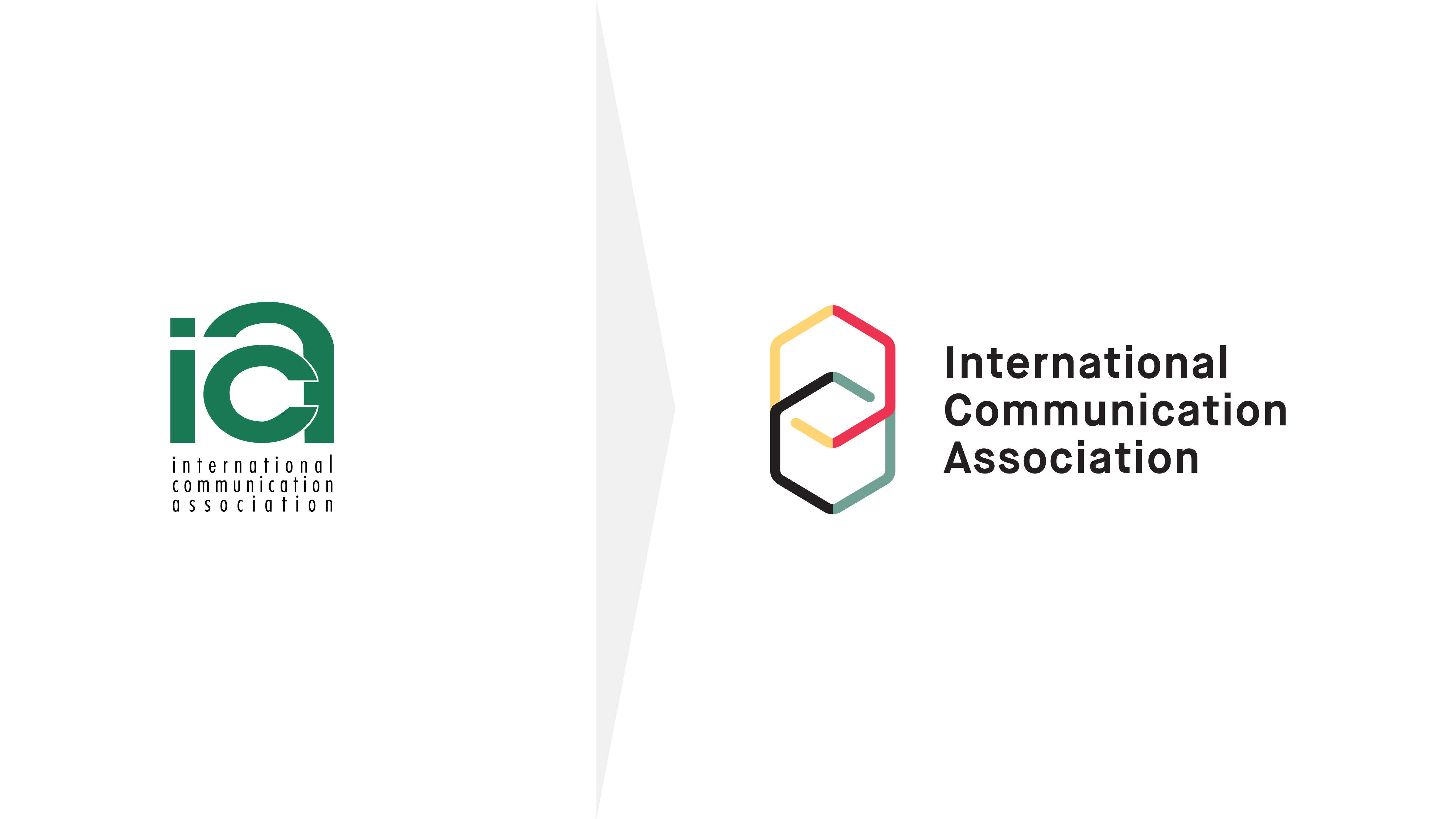
In our Landscape Analysis, we quickly identified that the typical symbols of human communication or interaction – from speech bubbles to quotation marks – were not only cliché, but narrow in their representation of the diversity of study areas in ICA’s academic field. The breakthrough came in identifying the concept of “interpretation” – the various ways we perceive, process, and connect every aspect of human communication. This concept inspired a new visual language for ICA. The logo’s icon is made up of 2 symmetrical cubes overlapping in the center of the mark. An optical illusion is created at the cubes’ intersection, with each cube seemingly completing the other. As the cubes intersect, they also appear as if they are linking together, creating multiple interpretations of what the viewer is seeing.
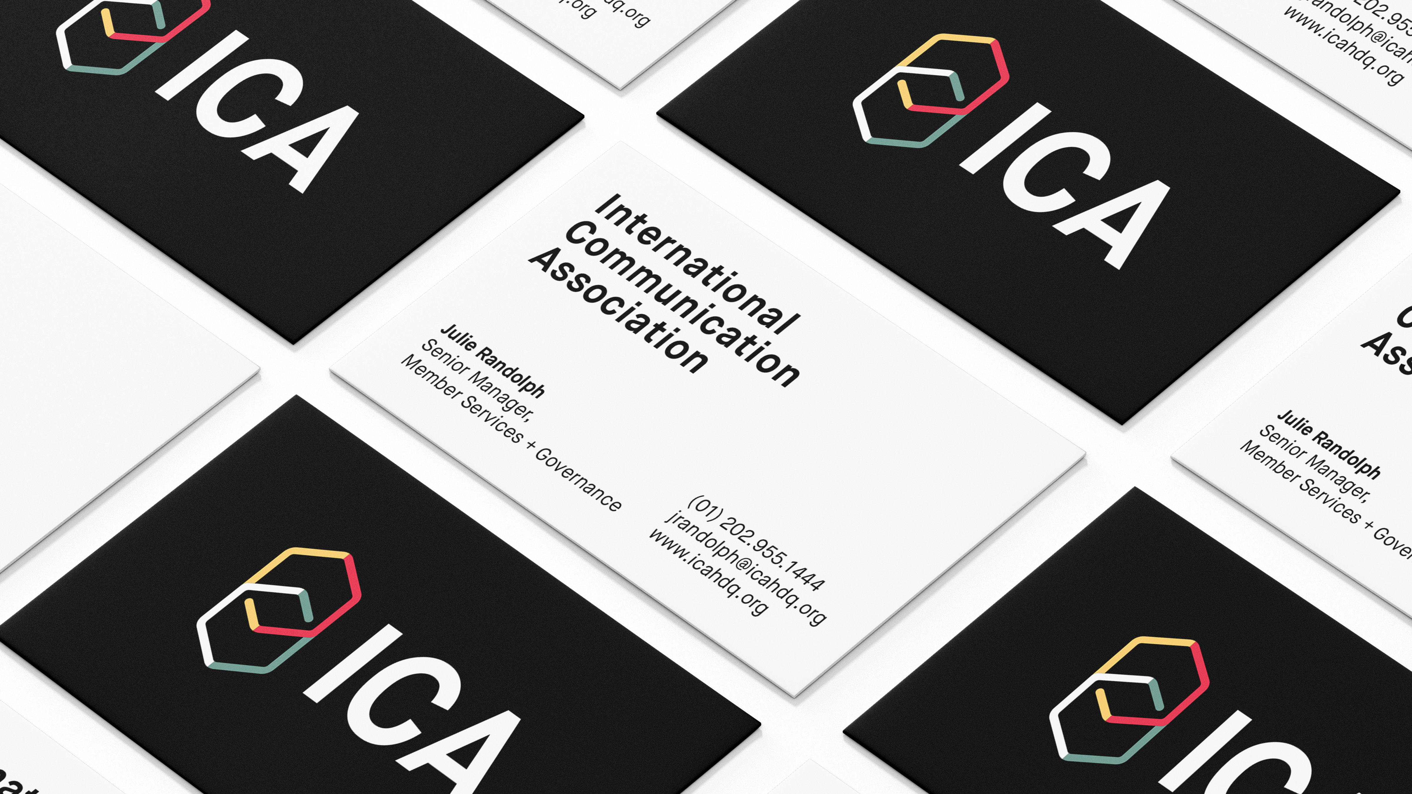
The logo’s elegant, colorful design and readable name addressed several imperatives, presenting the organization as a modern, diverse, and sophisticated community of scholars.
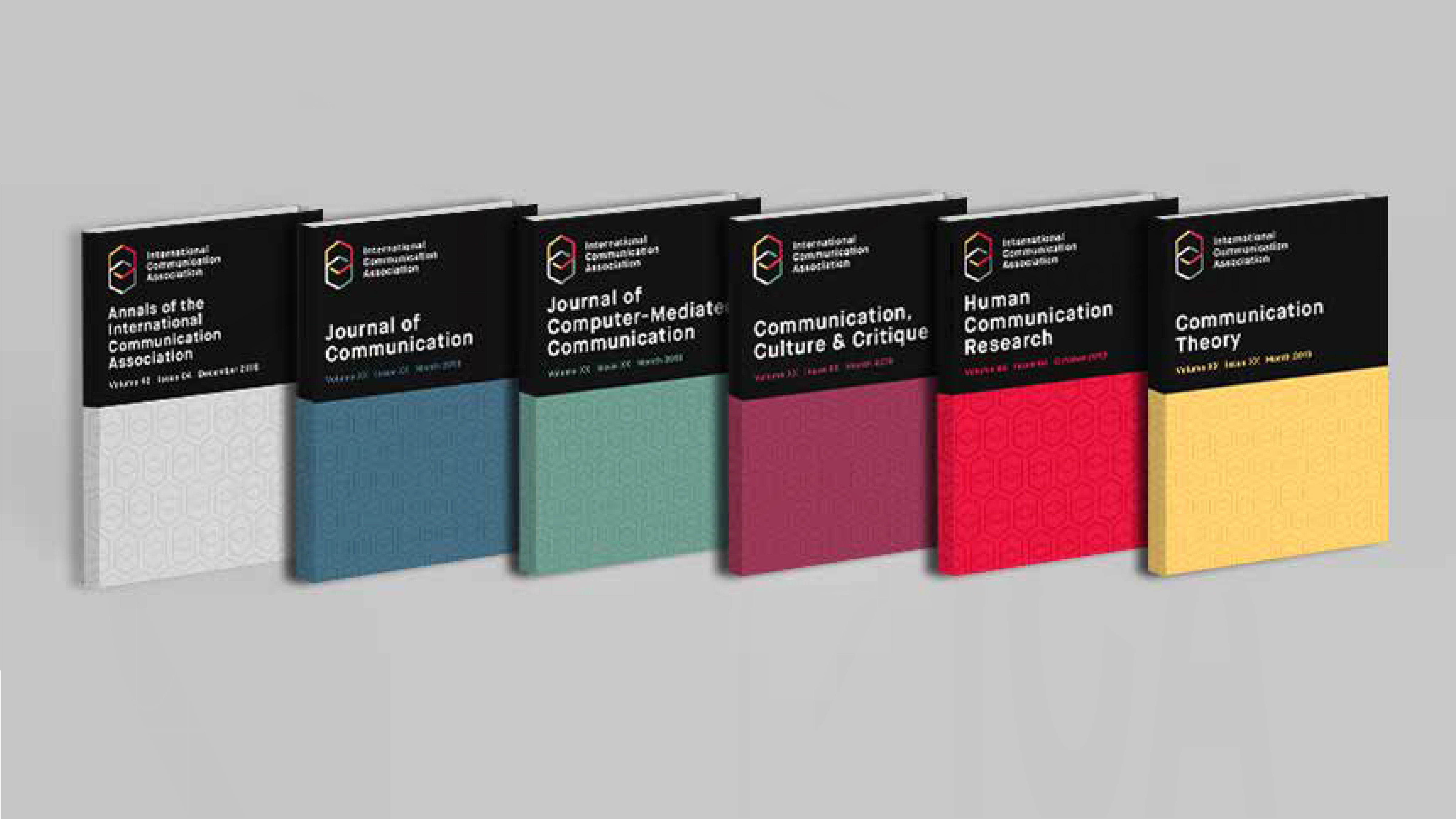
The new design system expanded the color palette, allowing ICA to color code its journals by subject area, and introduced a series of iconography to highlight specific content areas.

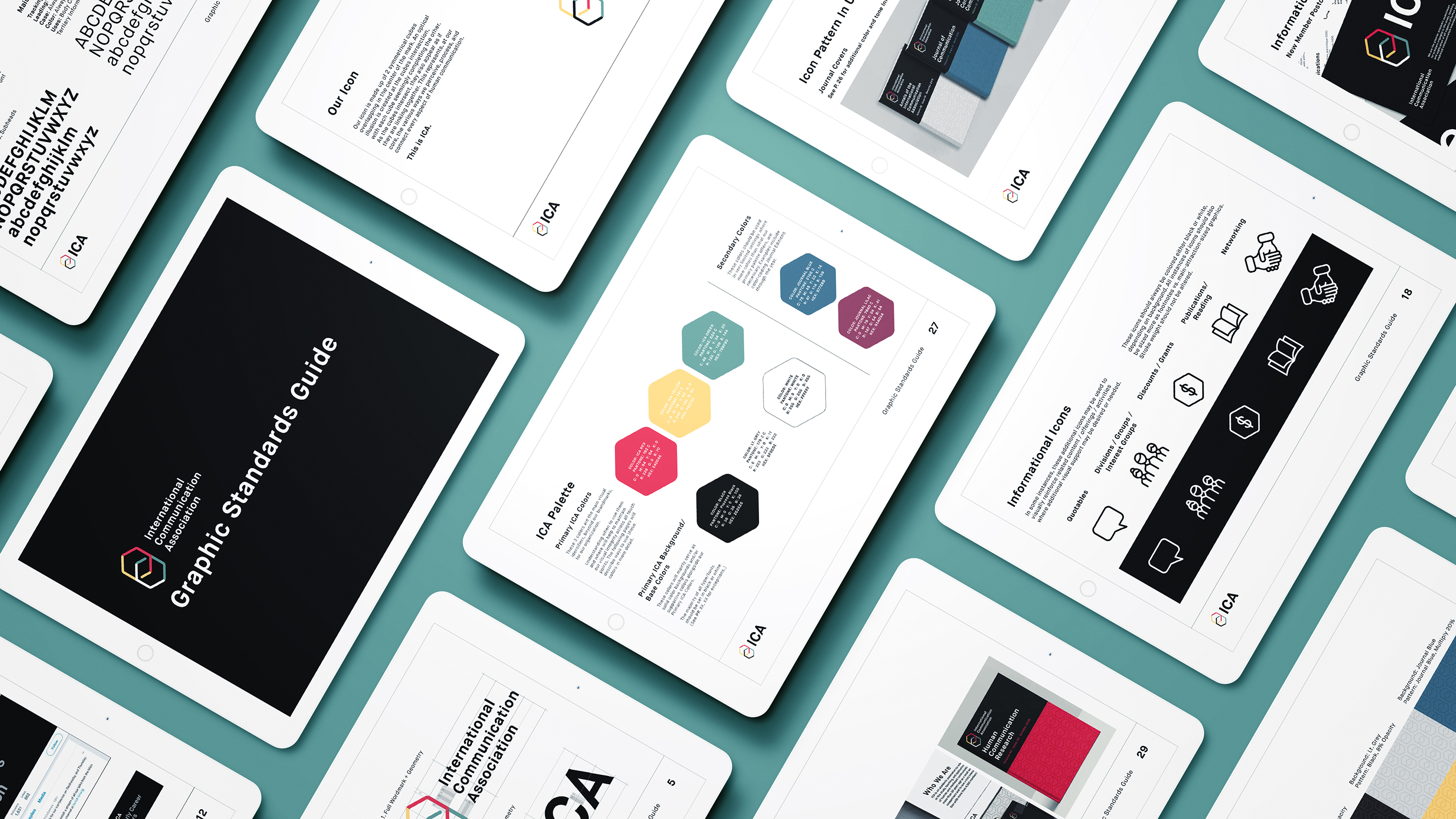
To provide a first-of-its-kind set of guidelines for the ICA brand, we designed a 37-page graphic standards guide, with new and in-depth descriptions of how to apply the visual language in day-to-day use. From codifying basics like font hierarchy to detailing a methodology for laying out logos for divisions and interest groups, the guide problem-solved long standing challenges, like representing all facets of the organization. In addition, we provided a robust set of digital assets – including individual iconography design and customizable logo lockups for interest groups – to ensure smooth rollout for the ICA team.
Services: Landscape Analysis • Logo & Visual Identity • Brand Guide • Collateral Design
“After my third time doing a rebrand (the first two with other organizations), I would never recommend anyone other than Mighty Good for this process. It became about so much more than a new logo, giving us an opportunity to have clarifying and enlightening conversations about who we are, where we're going, the community we exist within, and what we believe. The Mighty Good team made us comfortable from day one, gave us structure, and led us through a process without being prescriptive. We had a positive and efficient experience, we learned about ourselves as an organization along the way, and we ended up with a brand that, when it was revealed at our annual conference, received a standing ovation from a room of 4,000 members. Mighty Good is the best partner of any kind I've ever worked with, and I'd recommend them to anyone.”
– Laura Sawyer, Executive Director, ICA